Brand Identity Refresh
Minneapolis, MN
—
Brand Strategy & Management · Logo & Graphics · Messaging & Copy · Website & Digital Assets · Art Direction & Videography · Sales Tools & Marketing Asset Implementation · Social Media Strategy & Rollout
—
Human-Centered Design, Hospitality-Driven Experiences
As we planned for the MillerKnoll merger, we realized we were entering a new era for Intereum—one that called for a fresh, updated look.
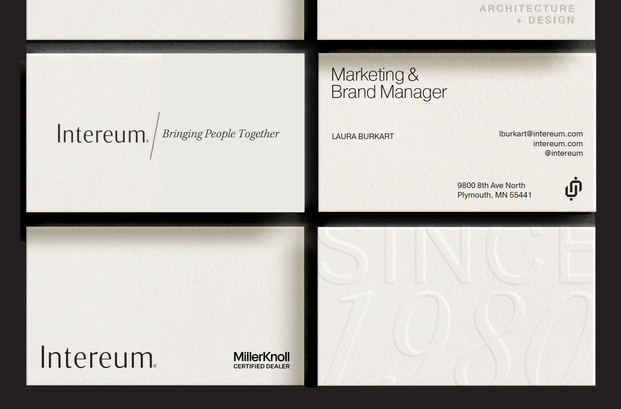
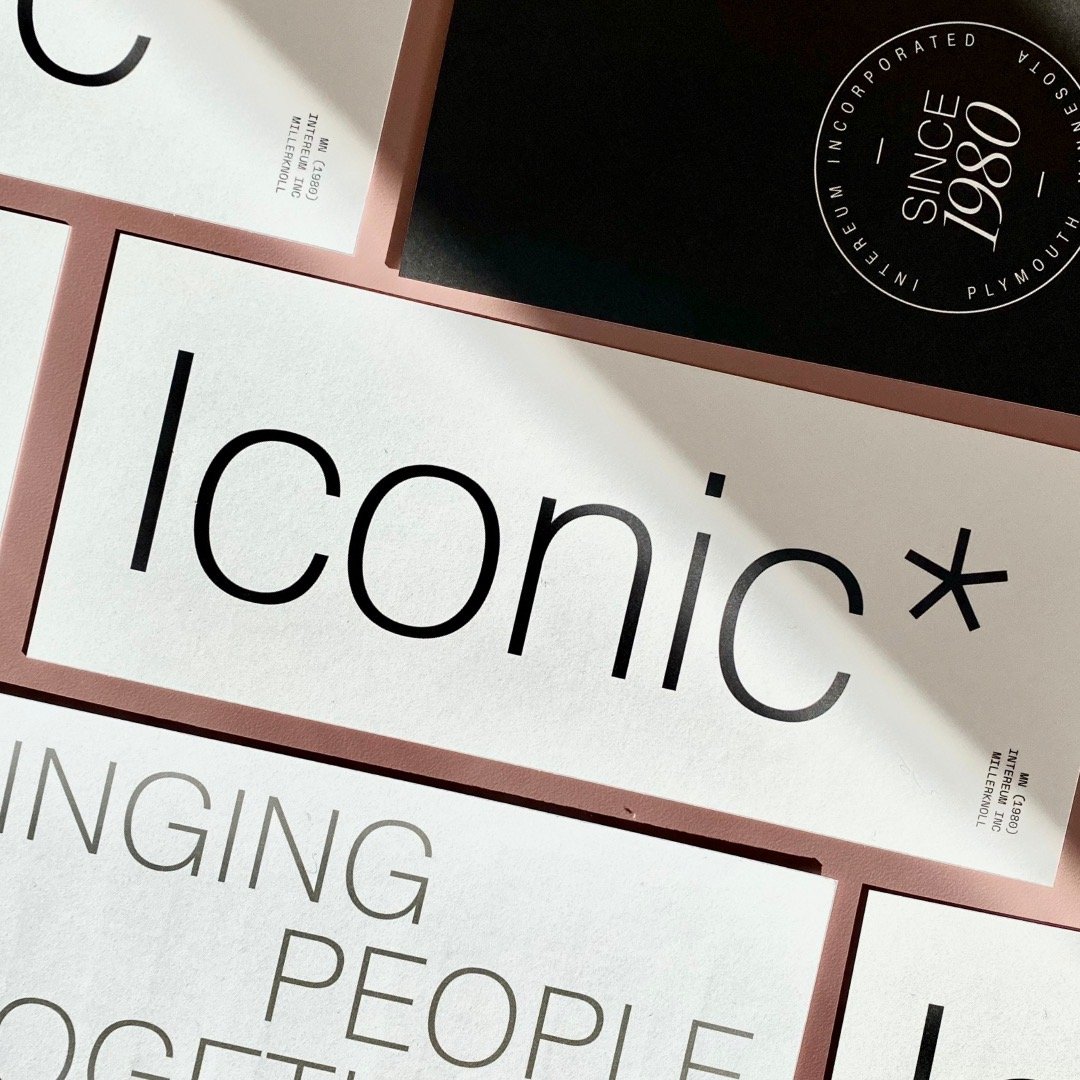
Our brand refresh aimed to elevate our identity to reflect our sophisticated, trusted, and people-centered approach. This new look celebrated our growth and reaffirmed our commitment to our shared goal: creating spaces that bring people together.
Since 1980
With a refined shift in the Intereum logo, we chose a sophisticated, classic font for our updated wordmark and removed the pairing of the icon element to allow our name to stand proudly on its own.
The neutral color palette and modern typefaces help support our refreshed look, while giving MillerKnoll's collective of brands the ability to truly shine through their product and environmental photography.


